
Project Background
The Textile Museum of Canada, the nation’s only museum dedicated to textile arts, offers a rich array of exhibitions and educational programs. However, users have expressed challenges with the website’s usability and navigation.
As a special client of the University of Toronto, the museum aims to redesign its website structure and navigation system to enhance accessibility and better serve its visitors’ needs.

Overview
A project for the Textile Museum of Canada
Project Task
-
Web and mobile app redesign
-
Information Architecture reorganization
My role
-
UX researcher - Conducted website crawling and generated the website's content list for content audit; Conducted two card sorting sessions with users.
-
UI designer - Completed desktop & mobile navigation wireframes/prototypes in Figma and Balsamiq.
Timeline
-
12 weeks (September 16 to December 6, 2023)
Project Key Component
Team
Kevin Zhang (Me), Megan Luo, Peggy Pu, Haimeng Song
Tools
Figma, Miro, Mural, Excel, DynoMapper
Deliverables
-
Comprehensive IA Diagram
-
Mid-fidelity prototype for the redesign navigation system
1. Define
User Needs Analysis
(Define the initial problem)
To develop informed recommendations for redesigning the information architecture (IA) structure, we first needed to understand the museum’s needs.
After attending an information reception hosted by the Textile Museum of Canada, our group identified the key needs on the right from the client about the website:
User-Friendly & Intuitive UI
User-Friendly and Intuitive – Visitors should be able to easily navigate the site and find information without frustration.
Improved Information Architecture (IA)
Improved Information Architecture (IA) – A clearer and more logical structure that enhances accessibility and discoverability of content.
Engaging for a Diverse Audience
Engaging for a Diverse Audience – The website should appeal to researchers, educators, students, and general visitors.
Aligned with the Museum’s Needs
Aligned with the Museum’s Needs – Any redesign should consider the museum’s resources, branding, and long-term sustainability.
Who's the target audience?

1. General Visitors
Individuals interested in museum, textile arts, or cultural heritage.

2. Researchers & Scholars
Academics and professionals studying textile history, cultural, or design.

3. Artists
Creative professionals looking for inspiration or exhibitions.

4. Educators & Students
Teachers and learners seeking educational resources.
My contribution
best part
From the lens of a UI designer, I kept reminding the team that the website redesign should cater to the above audiences by improving accessibility, content discoverability, and user engagement.
Website Content Inventory
To redesign the information architecture (IA) and navigation, we first needed a comprehensive inventory of all website pages. Using DynoMapper (See Figure 1), I conducted a site crawl to extract a complete list of pages. I then refined the data by removing PDFs, images, and duplicate links, resulting in a clean, structured Excel list for analysis.
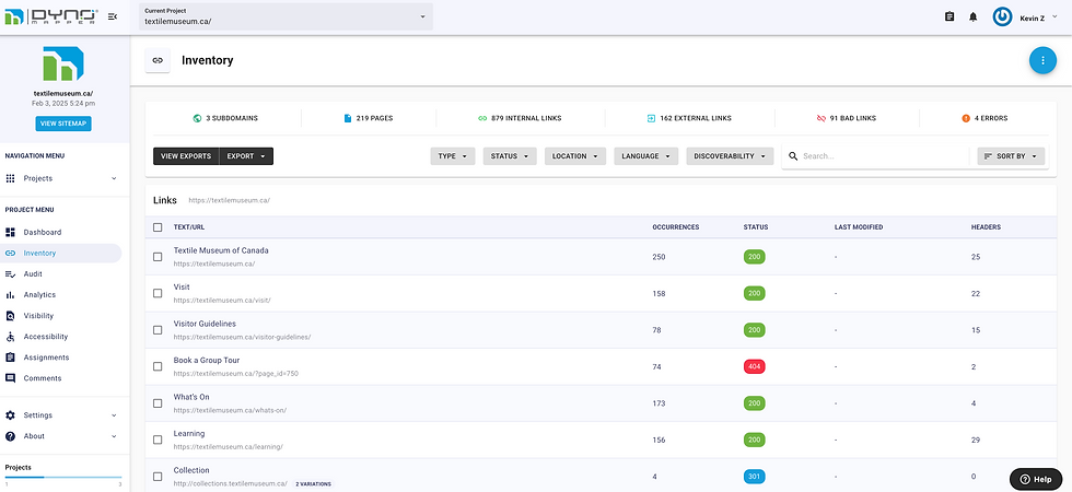
Figure 1: Snippet of content inventory on DynoMapper
Content Audit
To ensure an optimized website structure, we also needed to assess which pages should be removed, adjusted, or added. To achieve this, we conducted a content audit of representative webpages, evaluating them based on key criteria we collaboratively developed:
Actionability & Relevance
Assesses how well the page supports key business objectives such as ticket sales, donations, and e-commerce.
Audience Reach & Inclusivity
Evaluates whether the page effectively engages a broader audience, particularly underrepresented groups.
Functionality & Usability
Determines how well the page supports essential user tasks, such as purchasing tickets and wayfinding.
Accessibility
Reviews whether the page meets accessibility standards to ensure an inclusive user experience.

Figure 2: Relevancy Spreadsheet
During the content audit, two team members independently evaluated each audited page, assigning a score from 1 to 10 (1 = least relevant, 10 = most relevant) based on the predefined criteria. The average score (See Figure 2) from these evaluations was then used to guide our recommendations for refining the website’s content structure and strategy.

Overview of the card sorting
Card sorting revealed how users categorize information on the Textile Museum of Canada’s website. While concrete items like admission and tours were easily classified, abstract concepts (e.g., “social being,” “workshops”) caused confusion. Overlapping terms (“give” vs. “donate”) and redundant labels (“collection” vs. “your collection”) added uncertainty.
To improve usability, we recommended refining labels, clarifying overlaps, and redefining categories to better align with user expectations.
Card sorting process
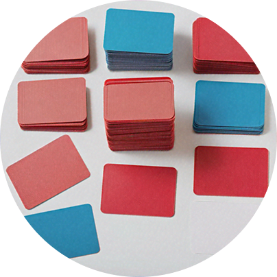
Step 1. Open Card Sort with 8 Participants

Participants were presented with 57 key cards representing crucial website categories. They were instructed to create their own groupings and freely discuss their thought process while organizing the cards.
Step 2. Moderated Sessions
All sessions were monitored in real-time, allowing us to observe participants’ decision-making processes and gather qualitative insights on how they interpreted and structured the website’s content.
Step 3. Follow-Up Questions
To deepen our understanding, we asked participants the following follow-up questions:
• How many categories do you see at first glance?
• Do any of the cards not make sense to you?
• Are there any cards that you think are missing?
• Which card was the easiest/most difficult to sort?
After analyzing and discussing the data from all eight participants, we transformed the results into a spreadsheet (Figure 3) that quantifies the relationship between individual cards. These calculated distances provide insights into the likelihood of cards being grouped together. We've colour-coded the cells in the spreadsheet based on their distance values.
Here's a breakdown of the colour scheme:
◽ Red Cells (0 - 0.33): Cards in this category are highly likely to be grouped together. This grouping is consistent in over 66% of cases. Cells with a value of 0 denote consistent grouping in every case, indicating significant importance.
◽ Green Cells (0.34 - 0.66): These cells represent cards with a moderate likelihood of being grouped together, occurring approximately 33% to 66% of the time.
◽ Yellow Cells (0.67 - 1): Cards in this category are less likely to be grouped together, occurring in less than 33% of cases.
Results
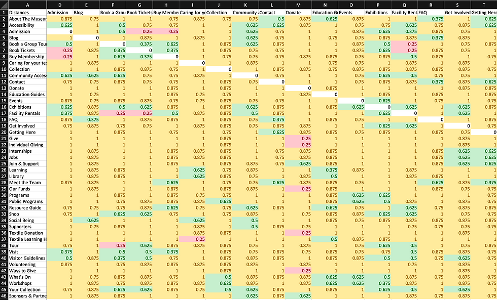
Figure 3: Snippet of Cards Relationship Spreadsheet
Key UX improvements in Information Architecture (IA) after Card Sorting
Clarify Labels
Use precise, user-friendly and easy-to-navigate terms
Streamline Categories
Reduce redundancy and refine groupings.
Provide Context
Add tooltips or descriptions for ambiguous terms.
My contribution
best part
I concluded the above recommendations, shared with the team, aiming to create a more accessible and seamless browsing experience for all visitors.
Strong Natural Groupings
Users intuitively connected transactional items (e.g., Admission, Book Tickets, Buy Membership) and thematic categories (e.g., Textile Learning Hub, Caring for Your Textile), indicating logical structuring.
Categorization Challenges
Some terms lacked clarity (Education Guides, Social Being), making grouping difficult. Overlapping meanings (Give vs. Donate, Collection vs. Your Collection) led to confusion.
My Key Findings
Information Architecture (IA) Breakdown
Our redesigned IA diagram for the Textile Museum of Canada’s website incorporates several key components to enhance usability and accessibility:
1. Main Diagram
• Level 0 (Home) – The central entry point for the website.
• Level 1 Categories (Dark Brown) – Primary navigation sections for high-level content.
• Level 2 Categories (Dark Grey) – Subsections under each primary category provide structured information access.
• Level 3 Categories (Light Brown) – More detailed subcategories for deeper content organization.
• Content Stack Pages – The lowest level, containing specific pages with detailed content.
2. Utility Navigation (Pink)
• Provides users with quick access to essential functions, improving efficiency.
• Includes Open Hours, Donate, Tickets, and Search, ensuring seamless interactions.
.png)
IA Diagram Design Breakdown
1. Establishing Diagram Objectives
2. Creating Level 1 Categories Based on Card Sorting
3. Defining Utility Navigation, Footer, and Features Collectively
4. Structuring Level 2 and Level 3 Categories Individually
5. Final Review and Collective Refinements
Task Flows
This section outlines four task flows (see Figure 5) encountered by users on the Textile Museum website: merchandise checkout, ticket purchase, guided tour request, and donation submission.
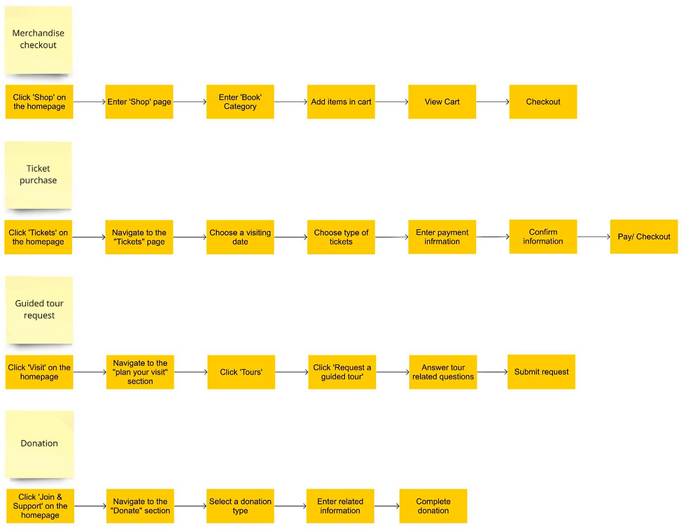
Figure 5: Primary Task flows
Relation to business objectives
Our diagram design is strategically aligned with our objectives, which were shaped by key insights gathered from the content audit and card sorting process.


Our team collaboratively defined the initial navigation structure. Leveraging my proficiency in Figma and Balsamiq, which I developed during my undergraduate studies, I designed and prototyped the navigation system to enhance usability and accessibility.
Key Enhancements
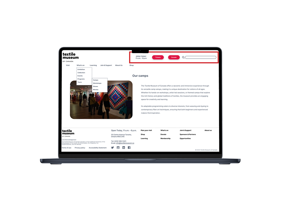
1. Redesigned Global Navigation with Multi-level Dropdown/Flyout Menu
• The original navigation buried critical information within a hamburger menu, making it less discoverable.
• Our redesigned drop-down menu introduces up to three levels of hierarchy, ensuring quick access to content while maintaining scalability.
2. Integrating Utility Navigation into the Header
• The previous header had minimal navigation options, limiting access to key functions.
• We introduced utility links such as Tickets to streamline ticket management and support the museum’s business objectives (e.g., ticket sales, donations).
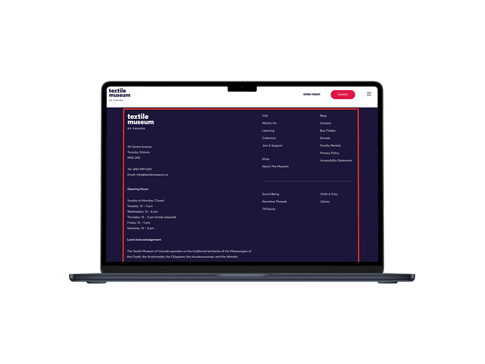
3. Simplifying the Footer for Better Accessibility
• The original cluttered footer made it difficult for users to find essential information.
• We streamlined the footer by moving key links into the drop-down menus, reducing cognitive load and improving efficiency.
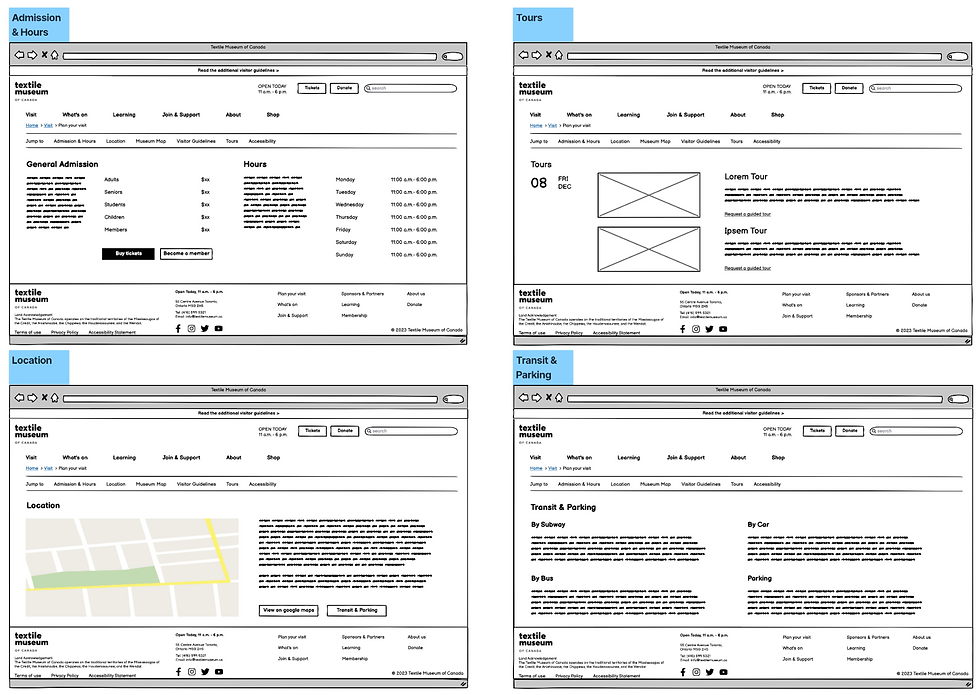
4. A sticky path for "planning a visit"
After a user enters the “plan your visit” page, we’ve implemented a sticky local navigation menu. This menu enables users to jump to their desired sections rather than continuously scrolling down the page.
Mobile-style hamberger menu
Header with less entries
Fat footer
Desktop Wireframes:

Before
After
Before
After
Before
After

Redesigned global navigation
New header with search bar
A footer keeping main entries
Mobile App Wireframes:
The mobile design focused primarily on redesigning and enhancing the clarity and usability of the original version. Taking the most common user journey—purchasing tickets—as an example, we optimized the existing process with a clear goal of improving the intuitive user experience.
"Purchasing Tickets" demo:
Users have two pathways to purchase tickets (see Figure 6).
[1] Users can click on “tickets” from the homepage, or
[2] Click “tickets” within the sidebar under the visit section.
[3] For users who want to explore the membership page is accessible by clicking on “become a member” .
[4] Otherwise, users can proceed by choosing their preferred visit date, as shown in the demonstration where December 9th was selected.
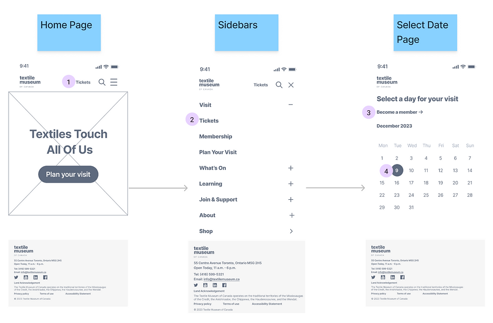
Figure 6: The flow illustrates the user’s journey based on the intuition
After selecting the date (Dec. 09), users will be navigated to the page (See Figure 7) where they can choose their ticket types and the number of tickets needed.
[5] Users have two options: they can return to the previous page to modify the date, or
[6] They can proceed by clicking “place order” .
[7] Upon navigating to the info page, users have the choice to go back to the previous page or
[8] They can enter personal and payment details, followed by clicking “continue to review” .
[9] After entering their information, users can either return to edit their details or
[10] They can proceed by clicking “complete order” .
[11] Upon completing the order, users can click “back to home page” to continue exploring the website.
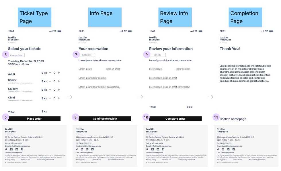
Figure 7: The flow illustrates the complete user journey in finalizing the ticket purchase
The Interactive Mid-fi App prototype:
Lessons Learned
As a UX designer, there are two critical aspects to consider when redesigning a website:
1. Aligning with Core Business Objectives
Every website, whether for a startup, government, or NGO, must be designed in alignment with its core business objectives. If the site’s logic deviates from these objectives, it can lead to a failed user experience.
2. Ensuring a Seamless User Journey
The completeness and clarity of the user journey must always be a priority. For instance, a complex donation process will discourage users from completing the task, making that module a design failure.