
EventZone
An app that ensures event enthusiasts never miss any incredible moments with their friends
Problem Identification
One issue that has been a focus of our attention is the frequently missed opportunities for our event enthusiasts to participate in the incredible events in Toronto. Our goal is to understand why this problem persists and to pave the way for further exploration.
Why do we miss out on events in Toronto?

What are the deeper reasons behind this?
Project Overview
A University of Toronto INF1602H UX Project
My role
-
Project manager - Allocated the design process, streamlined communication, and guided team reflections, leveraging 6 years of marketing project management experience.
-
UX researcher - Led usability testing by creating interview questions and questionnaires.
-
UI designer - Collaborated with the team to generate and refine ideas during ideation and prototyping.
Project Goal
-
Identify the reasons why people miss out on events.
-
Uncover the more profound logic behind these missed opportunities.
-
Provide viable solutions to address the problem effectively.
Timeline
-
12 weeks (September 16 to December 6, 2023)
Team
Kevin Zhang(Me), Ana Algarvio Alves, Nicole Lai, Jessica Kuo
Tools
Figma, Miro, Mural, Canva
Deliverables
Interactive High-fidelity Prototype
Project Key Component

My contribution
best part
As the project manager of our team, for design quality, I consistently reminded my teammates not to jump to solutions too early before the project kicked off.
Instead, I suggested the team first identify why people miss out on events in Toronto before considering any potential solutions.
Design Process
The entire design process spans 12 weeks and involves three brief but insightful discussions, each lasting 10 minutes, with Toronto-based UX industry experts and seasoned designers.
These discussions cover the findings from our research analysis, the ideation outcomes, and the prototyping progress.
Questions leading the reserach
From the lens of an event lover, the following scenarios linger in the team before conducting the research, and we want to know WHY:
Missing an event because no one reminded us?
Having difficulties inviting a friend to an event, but ending up with their schedule conflict?
Easily forget too much event information on social media?
Feeling stressed jumping back and forth between the event website and the calendar?

The above questions serve as the foundation of our research.
Research Method
Our team conducted primary research by distributing survey questionnaires and conducting interviews. The survey and interview combined closed- and open-ended questions to gather insights on event-seeking behaviour.
User Interviews
Conducted interviews with participants living in Toronto to explore their experiences in discovering, attending, and providing feedback on events.
Surveys
Distributed a 11-question survey to 56 participants in total regarding their experience and feedback when they attended or missed events in Toronto.
Secondary Research
Conducted academic and industry research by analyzing academic reports, case studies, social media content, and existing user reviews.
12
Participants for a user interview
29
Survey responses collected
7
Independent secondary research conducted
Quantitative data interpretation
(Survey result examples)
Insight
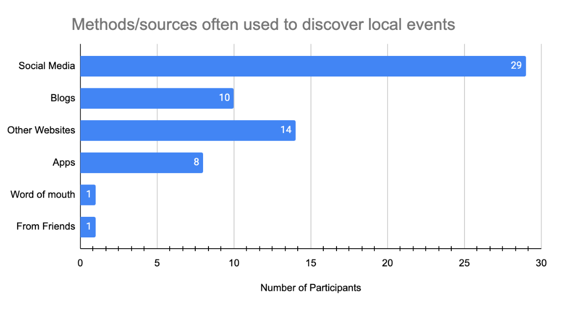
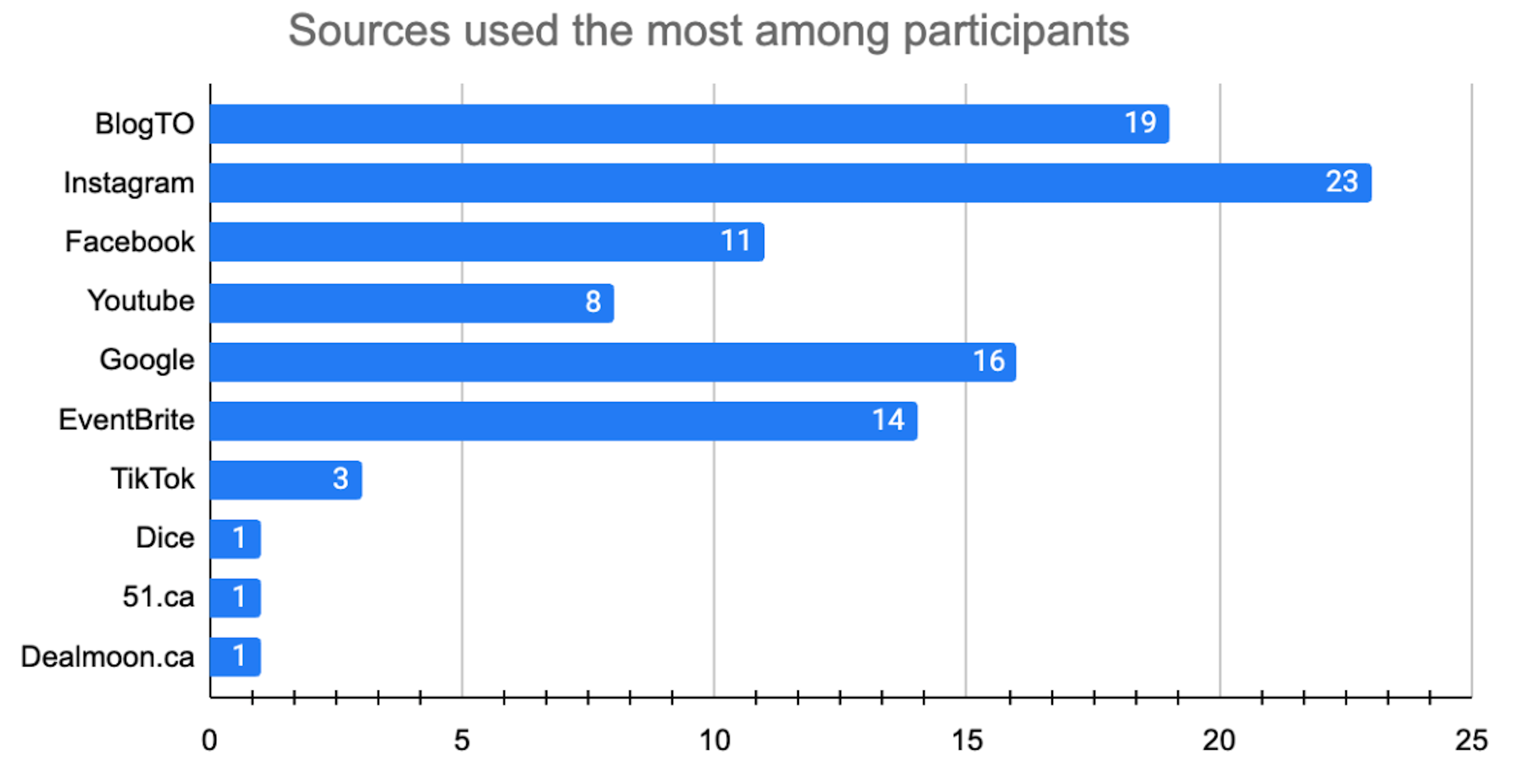
All participants rely on social networks to find events, so a social-first design approach is essential during ideation.
Insight
Boosting event discoverability requires stronger search visibility and increased social media exposure.
Insight
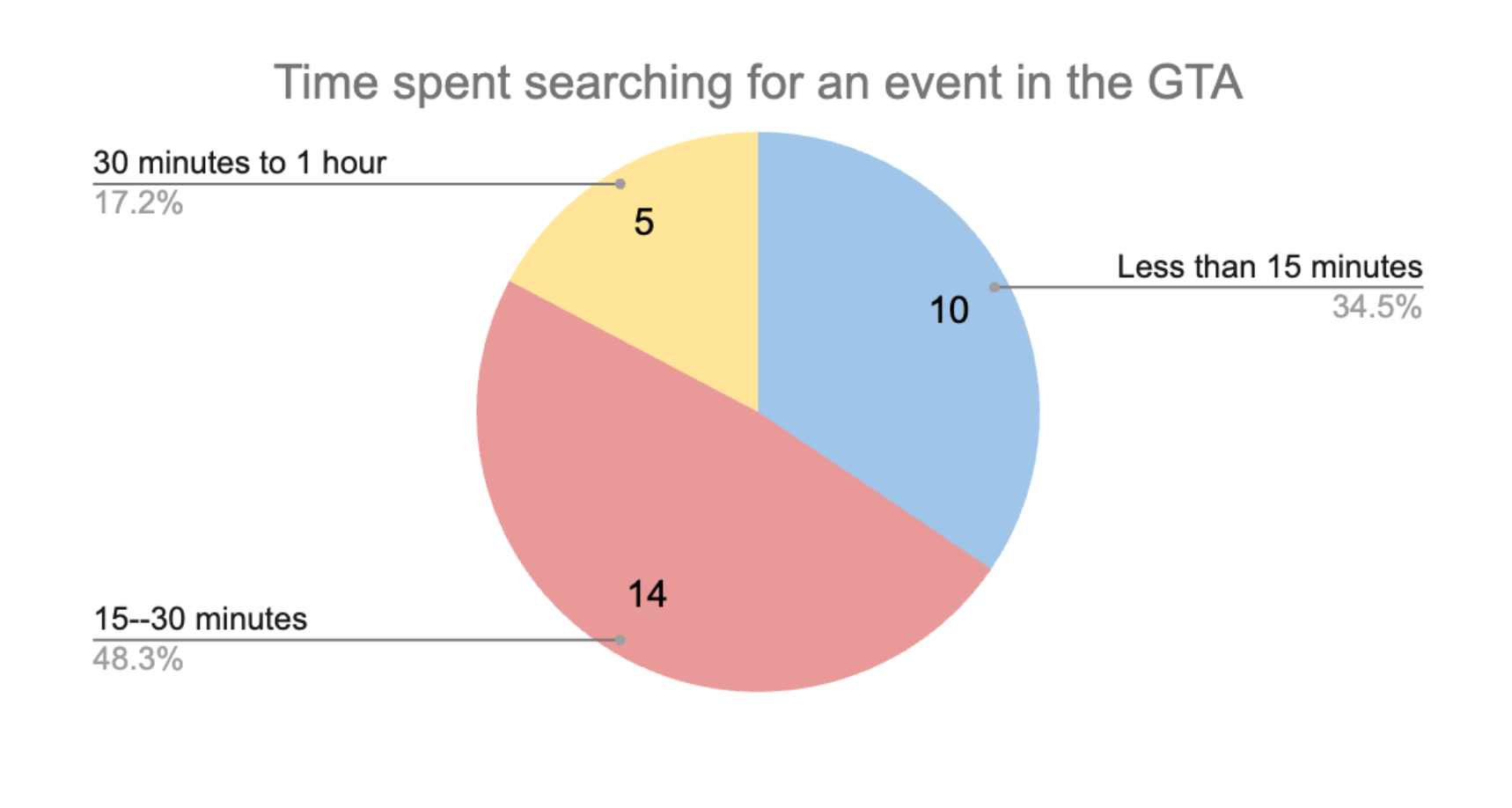
Enabling users to discover, coordinate, and confirm events within 15 minutes is key to a seamless user experience.
Quantitative data interpretation
(Interview result examples)
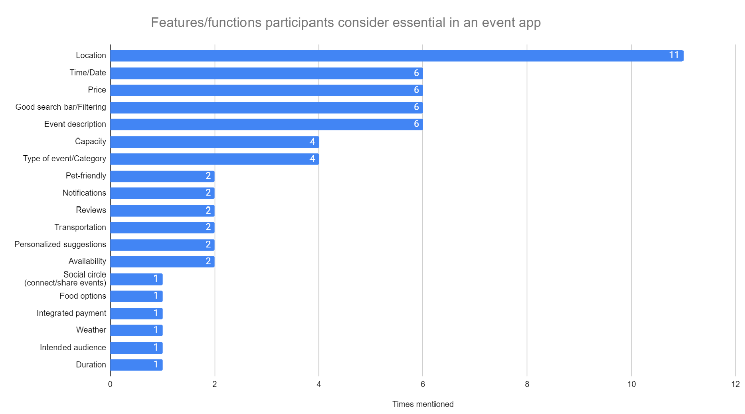
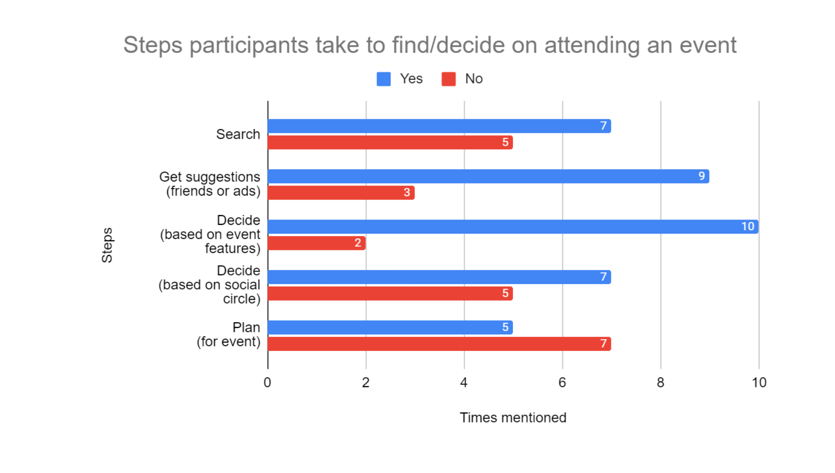
We also applied quantitative analysis to our 12 user interviews, translating responses into charts and graphs to identify key insights and trends.
Insight
Since location is the top priority, date and time must be seamlessly integrated into the user’s location-based decision-making.
Insight
Friend recommendations and social influence heavily impact participants’ final decisions.
Qualitative data interpretation:
To gather insights, we categorized our qualitative data collected in an affinity diagram to find if there were any patterns or themes from 12 user interviews.

As a team, we have conducted secondary research by researching online to gather information regarding event findings. The types of sources we found during our secondary research include a social news aggregation/blog post website (Reddit), blog articles (blogTO), news articles (CTV News, CBC) and academic sources.
Our preliminary secondary research indicated people in Toronto are experiencing a hard time aligning their schedules with their friends to attend events together, and it is tiring to find event information scattered across different sources.
There's a need for an accessible, well-designed event-finding platform that addresses social isolation, affordability, and usability concerns.
People use one app to check the event details, then jump to another app to book the event ticket, eventually landing on the desktop website to finish the last checkout process and receive the order information.
To incorporate better discovery tools and features inspired by global platforms shown to be a trend in product design.
Secondary Research Main Findings
Event Attendance Patterns:
Participants generally attend events once or twice a month.
Primary Research Main Findings
Preferences in Event Types:
The primary interest lies in music events/concerts and festivals, with notable interest in food and educational events.
Motivations and Reasons for Missing Events:
-
Primary motivations include socializing with friends, personal enjoyment, and experiencing new things.
-
Common reasons for missing events include not being notified on time, busyness, lack of companions, cost, fatigue, and difficulty in finding events.
User Feelings Towards Current Platforms:
-
Frustrations with inaccurate information on existing platforms lead to feelings of being overwhelmed.
-
Desires for a simplified, one-click-for-all service, especially for event sharing.
-
The majority expresses reluctance to attend events alone.

My contribution
best part
As a UX researcher, I
-
Conducted three user interviews, and completed the interpretation
-
Distributed the surveys, collected the data, and initiated two rounds of secondary research, including scrutinizing a Japanese event website to compare it with similar Canadian event websites.
Design spark #1
“I find it very stressful every time I need to send event information to my friend via Instagram, and then wait days for the confirmation. Eventually, we didn’t go to the event together…”
—Brian, an insurance broker in Toronto
A comment left by one of our 12 interview participants stood out to our team, prompting us to further explore the underlying motivations behind event invitations.
Based on our research insights, please meet Elora the Explorer — a University of Toronto student known for actively attending various events across the GTA. To steer clear of unintentional biases, we meticulously shaped our persona based entirely on user research data.
Persona:

Empathy map:
Besides the persona, we devised an empathy map to illustrate Elora's emotions, thoughts, and actions.
The empathy map enables us to gain a deeper understanding of Elora's requirements and effectively prioritize them.


My contribution
best part
To better understand Elora’s experience, I mapped her journey from event discovery to participation using the as-is scenario method, grounded in insights from 56 participants and supporting survey data.
As-is-scenario:

Elora's current situation details her experiences throughout the process of discovering, deciding, planning, and attending the event. This enabled us to pinpoint particular areas where Elora required the most assistance. Easily speaking, what's Elora's need?
Design spark #2
Based on the findings, coordinating plans with friends can be challenging, making it tough to sync up schedules for shared events.
Additionally, determining a friend's interest in a specific event is often tricky, addressing a common pain point for users like Elora.
Building on the As-Is scenario, our team identified five key need statements to inform our next big ideas:
Elora's need statements:

My contribution
best part
As we enter the Ideation phase, I emphasize to the team that it’s not yet time for solutions. As a UX researcher, my priority is to extract Elora’s true needs from the As-Is scenario.
Grounded in our research findings, I continually remind the team to focus on analyzing Elora’s pain points and unmet needs—ensuring our ideas are driven by real user insights, not assumptions.
Plan centralized
Elora needs a way to consolidate event information on a centralized platform so that she can make informed decisions without navigating multiple sources.
Find her interests
Elora needs a way to filter and sort content easily so that she can find events that align with her interests and preferences.
Schedule with friends
Elora needs a way to coordinate event scheduling with her friends so that she won't attend events alone.
Being informed
Elora needs a way to proactively be informed about relevant events in the GTA so that she can avoid missing out on events that matter to her.
Events on the map
Elora needs a way to find events that are close to her so that it's more location convenient and accessible for her.
Big ideas popping up!

When we incorporated the above big ideas into Elora's current scenario, we were delighted to see that our solutions would help her find an event to attend.
After implementing these ideas in Elora's as-is scenario, we realized several pain points had been eliminated, which truly delighted the team.
Considering Elora's needs, our team generated 12 distinctive big ideas. Each member voted on the feasibility and impact of each concept.
After plotting our ideas in the prioritization grid, "Home Run" ideas floated on the surface, leading us to the next design process.
Prioritizing our ideas:

Home runs ideas won the team
"Friend attendance notifier":
Notifying Elora about which of her friends is attending an event.
"Personalized event suggestion"
Recommending events that match Elora's preferences at the right time.
With Elora’s pain points in focus, our team developed a low-fidelity prototype and named it EventZone—a virtual space designed with strong social features to help users easily see which friends are attending an event.
In the following low-fi wireframes, we can find 3 tasks being performed:
-
Accessing preferred events in Toronto through notifications (Notification >Homescreen)
-
Finding events information to know the details (Homescreen > Detailed Event screen)
-
Deciding to go to an event by checking on friends’ availability and interest (Homescreen > Feed > Detailed event screen > Calendar screen)
Accordingly, our team melted feature implementation into the following user flow, addressing Elora’s needs.
EventZone Low-fi Sketch:

EventZone spotlight
The feature to check who's going to which event is interesting to Elora.
From the “Feed”, Elora was surprised to see that her friend Chris was going to attend the rib festival, which also interested her. She clicked in to check more details about the event.
Elora “added” the rib fest event to her own calendar, the event reminder and details have automatically been stored under the “My calendar” screen
Click for larger view
EventZone Mid-fi Main User Flow:

Lean evaluation:
Based on the low-fi prototype, we executed a quick usability test involving three representative users, who are young professionals living in Toronto.
The test assessed their ability to complete the task flow successfully.
Employing the think-out-loud protocol, we instructed the users to accomplish the the following three tasks:
-
Access preferred events in Toronto as fast as the organizer reveals the event
-
Find event information to know the details
-
Decide to go to an event by checking on friends’ availability and interest
Positive feedback
-
They were all able to complete the tasks
-
A user thought it was easy to find the event information
-
Users like the amount of tasks they can do on the event page (i.e. share, favourite, add to calendar)
-
“Call to action” buttons were very clear on the event detail page
Negative feedback
-
The app does not direct the user directly to the event page after tapping on the notification
-
Couldn’t message friends on the app
-
Can’t see who favourited the event
-
Confused that they can’t add or search for friends
-
Concern about encountering friends she doesn't want to see at the event & wants to see which friends are attending (for a specific event)
-
Confused aboutthe “Calendar” screen (if it was for them or the organizers)
We refined our prototype accordingly, keeping in mind the negative feedback that shared great value.
Changes we made for the mid-fi wireframes:
All three participants expressed strong interest in seeing which friends liked an event on the event page, encouraging us to expand our low-fidelity sketches to explore this feature further.

Two participants mentioned whether the search button could be used not only to find events but also to search for friends. This insight provides a valuable hint.


All three participants stated that it would be highly appealing to be able to clearly see which friends are attending specific events.


The participants love the map feature and are eager to visually see what events are happening nearby.

My contribution
best part
As a UI designer during this prototyping phase, I was fully responsible for making the high-fidelity prototype and contributed plenty of design creatives, such as the “Call-to-action button,” “Friends’ attendance display,” and “Add to calendar.”

EventZone High-fi User Flow Spotlight:
It's really fun to find which friend is going to which event.
It's really great to see everyone on the participant list, already added to my calendar!
I love "searching" for my friend!
EventZone High-fi Prototype:
5
Representative users
3
Designed tasks
Think-out-loud
Protocol
Goals:
-
Assess the overall user experience of the app
-
Identify any usability issues and areas for improvement
-
Figure out if users' needs are met
Evaluation methods:
-
Usability test: to evaluate the predetermined set of tasks for our interface
-
Semi-structured interview: collect further opinions from the user right after the usability test
Things that worked:
-
Straightforward interface and smooth process when using the app
-
Friend attendance notifications drove the attention; they liked seeing other friends’ activity
-
The event details page gets liked by one user
-
Having a favourites page showing what they liked
Things to change:
-
Add more content into event details such as dress code
-
To discuss the necessity of the "Registration" button
-
Purchasing through the app
-
Synced calendar
-
Link to Google Maps for the event locations
Analyze and interpret the data:
Participants expected to have additional features such as implementing Google Maps, messaging friends, and buying tickets.
The feature allows participants to see that their friends' activities are very welcome. The three tasks are overall simple to navigate and successfully completed.
Integrate maps to check events nearby
Enable user to add events to their personal calendar, providing them the flexibility to choose from such as Apple Calendar or Google Calendar.
Look at how Eventzone can gather event information quickly from the organizer (organizer as another persona)
Develop in-app messaging so users can contact friends without switching apps.
Homepage events information enhancement, allowing user to quickly browse events nearby, happening soon, or popularity.
Enable users to register for events directly through the app